Your mission, should you choose to accept it, is to tell me what you want to see on the LCD screen that will replace the right most gauge on the dashboard.
It's about 1" square and 132x132 pixels. Multiple pages of display will be available (using a button to cycle between them). We've incorporated a light sensor so that it can dim at night and shine as bright as possible in sunshine.
Now, what do you want to see?
(Don't worry, I have lots of ideas - but I figured I'd ask you guys as well)


Perhaps I'm not exactly accepting the mission, but I do have a suggestion. Regardless of what you choose to make available in the display, if you have more than 3 or 4 options, please consider allowing a two-way scan. I have a Camry Hybrid which will allow me 9 different options to be displayed on one spot of the dash. If I go from the first to the second, I must then cycle through all of the other options to get back to the first. A reverse option would really be nice.
Ahh, a very good suggestion. Alas, I was thinking of just using one button to cycle through. I'll see if I can come up with something (depends on how many buttons the hardware folks will "give" me!)
John H. Founder of Current Motor Company - opinions on this site belong to me; not to my employer
Remember: " 'lectric for local. diesel for distance" - JTH, Amp Bros || "No Gas.
Current pack voltage, current battery amps, Ah used / remaining, kWh used / remaining (those must be learnt initially), voltage of the cell with mimimum voltage (a BMS thing, in order to keep the rider informed of a possible cell demise should he/she overdo it), one trip meter counting forward, one counting down depending on some of the aforementioned values (must be highly damped though so as to not make the rider overly nervous by constantly decreasing and increasing ranges, battery temp, (somehwere from the inner core of the pack), controller temp., motor temp.
Just to name a few :-)
My rides:
2017 Zero S ZF6.5 11kW, erider Thunder 5kW
May I suggest a small, three position, rocker switch?
Here's my $.02 on the matter. I'd like to address the input method first, as that influences what's displayed.
For me, a single momentary switch to control the display is optimal. I have an older Cycle Analyst 2.0 on my Z-20a, and a quick bump of a single button cycles to the next display mode while riding. Holding in the button when the unit is already on resets all the counters, much like a trip odometer. When I'm stopped and need to configure it (making settings for wheel circumference so that it can calculate speed correctly, etc.), you hold in the button while powering it on, then navigate all the configuration menus with that same button. Configuration would be simpler with a second button or alternate input method, but while I'm driving I want the input method as simple as possible. Since the display on the CMC scooters will already be customized for them, there may not even be a need for a setup menu.
As for the display, while riding it should be able to alternate between speed, instantaneous current draw, pack voltage, Ah/mile (or Kwh/mile), and Ah remaining; possibly some of these could be combined to be on the display simultaneously, but I'd rather make the display easy to see at a glance while at speed. When I'm stopped, that's when I would want to see thing like min/max cell voltage, min/max pack voltage, peak current draw, peak regen, avg./peak speed, avg./peak Ah/mi (and motor temperature min/avg/max if that's available). Perhaps instead of holding in the button to reset it as on the Cycle analyst (since it's an add-on and doesn't have a method of determining when the battery pack is recharged, unlike the BCU), holding the button could put the display into an extended display mode where you can see all these min/avg/max stats.
Obviously, if something occurred like a cell over/under voltage or motor overheating condition were to happen, I'd want that to over-ride what I have set to display, and give me a visible alert of what the problem is.
One final note, I prefer ratings in Ah rather than Kwh; I find it easier to think about a 60Ah pack than a 5.76Kwh (nominal) pack when I'm riding.
Jon Stibal
2008 EVT America Z-20A
2011 CMC C130 - my daily driver:
Let's see... Probably nothing novel here:
On thing I'd like to see is a cell voltage check - say, 24 or 30 cells using 4-6 calibrated bars or three digit characters at a time. But I understand that this would be difficult to implement as the BCU does not currently have a means of doing this.
A couple trip odometers - which won't have the big error that the current mechanical odometer has. Having these odometers reading differently from the mechanical odometer is not very elegant - but I guess the mechanical odometer is still needed for title transfer purposes.
Motor and controller temperatures
Pack current
Once calibrated, the "fuel gauge" works so well that a SOC indication seems kind of redundant, but you might as well include it too.
Miles-left-on-charge - based on, say, a rolling average the AH per mile over last 5 or 10 miles (user selectable?)
Make any digital indications sufficiently large - remember your buyers who are over 50 and don't wear their reading glasses when riding.
I agree with what was stated above, if having more that 3-4 options, back and forward buttons to navigate the menu would be nice. And a reset functions if both buttons are pressed simultaneously.
First of all i would like to see the odometer and trip meter to reside where the speedometer is, not at this display (to lessen the number of things there and make the layout more logical).
Of course the display must be able to use both miles and km's.
At such a display i would like to be able to see:
Screen 1: Levels of Voltage and Amps, maybe both as a bar graph and numbers if it can be fitted.
Screen 2: W/km or Ah/km not sure what is best, but current "spending"
Screen 3: Km's (miles) to go before battery is out at current "spending" (and it is important that this is reasonalbe accurate since if you cant trust it it is unusable and is better left out)
Screen 4: Temperature of the batteries and motor, and possibly some other indicator, for instance from the BMS, which will indicate the state of the batteries (maybe just an indicator if the balance is good or not, least cell voltage or something).
Screen 5: Road temperature, Clock
At all times "juice left", as a small bar or similar - I know this is difficult and would need some smart algorithm, but to see how much you have left would be really nice (like in a normal gasoline powered vehicle).
/K
Great suggestions everyone.
Here's what I'm thinking:
Hardware interface
Light sensor to allow auto-dimming at night.
3 input buttons:
- one offset by itself that will work the trip meter/odometer function just like you'd expect it to. Call this the "odo button". We will probably no longer have the mechanical versions. The digital version will suffice for legal requirements (we will not publish any API to reset mileage!!!)
- two buttons to control backward/forward function. I was thinking of two buttons next to each other. These will be momentary contact switches Call these the "ui buttons".
- a single push on either button goes up or down a page
- two buttons should also give me a lot of opportunity for accessing different more advanced functions (long presses, or press both at the same time). More on that below
Info Display
Basic display will be as follows:
- a header that takes up about the top 15% of the screen. Consisting of a row of four indicator "lights" across the top. This will show the four different things that can disable the Kelly (sidestand, brakes) and also whether you're in hi or lo.
- a footer that takes up about the bottom 15% of the screen. In normal operation this will show the odo or a trip meter and possibly the state of charge as percentage remaining (might not have enough room). Select between the odo and trip meter with the "odo button". A long press of the "odo button" will reset the trip meter. When an important event happens the footer will display a message alerting you to what's going on (i.e. instead of the single LED blinking a pattern)
- the header and footer will be displayed on all the running screens.
- the remaining 70% of the screen will switch between the following (order is still to be determined)
-- instantaneous amp draw. Color coded between green for regen, blue for "normal" draw, red for "high" draw. Consider this a simple tool to encourage efficient riding.
-- speed.
-- temps as bar graphs (motor, power leads, battery pack)
-- "range": this will have details of efficiency as Wh/mile over the last X miles (X will be user selectable but defaults to 10) and miles of range based on that figure. Note: I reserve the right (naturally!) to not implement a range page if I can't get something that is more useful than the Vectrix implementation of this feature. I cheekily refer to the Vectrix range number as a random number generator! It usually starts at 40, falls to 20 (after <5 miles of riding) then maybe climbs to 23 and then falls to zero (in the next 10 miles of riding). How, exactly, is that helpful? Now, cheekiness aside, I have a LOT of respect for the Vectrix engineers - so, IMO, there must be a "back story" as to why that feature is so poor on their bike. In other words I might well find a gotcha here.
"Advanced" option. This will be selected by either a long press of a UI button or pressing both UI buttons simultaneously. This will add the following additional pages of display:
-- Pack Voltage along with BMS controlled minimum.
-- Cell Voltage along with BMS controlled minimum.
-- Power calculation
-- "Kitchen Sink" this will display pretty much eveything I can cram on there. Not designed to be used while riding but a simple diagnostic tool.
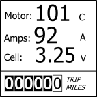
-- A combined display of motor temp, amp draw and cell voltage.
"History" option. This will be selected by either a long press of a UI button or pressing both UI buttons simultaneously.
-- this will show min/max/avg values for various attributes (amps, pack/cell volts, power, efficiency, temps)
Now, what do you want to see while charging? I'm thinking that the display will normally be off but will wake up when you press one of the ui buttons. At that point it will show
-- kWh into pack so far
-- current State of charge
-- time remaining until full
-- pack health (probably not this time around - but when we develop better health algorithms)
Display Configuration options
At a minimum the display will start up on whatever display you had showing when you switched off the bike.
Other possible configuration options (this is the nice-to-have stuff that will be dependent on time/resources):
- a preferred start screen
- select which pages you want and which order you want them
- units (first version will be Imperial units reflecting the current market)
- brightness levels for nighttime and daytime
- switch on or off the header (can't switch off the footer - we need to display odo for legal compliance)
- what else am I missing?
LED Blinky
The single red LED will still exist. How should we use it? It will no longer have 15 different blink patterns to display (that function will be replaced by far more meaningful text messages (and there will be much happiness and rejoicing!)). What do you think?
Bike Configuration options
Now that I have a more suitable UI we can start to expose some of the configuration parameters to the advanced user. However, that won't come until much later - but put your thinking caps on and tell me what you want to configure (depth of discharge, regen etc.)
John H. Founder of Current Motor Company - opinions on this site belong to me; not to my employer
Remember: " 'lectric for local. diesel for distance" - JTH, Amp Bros || "No Gas.
Looking good and most certainly looking forward to the new LCD.
My quick thoughts:
- Keep it simple. It is very easy to geek out on engineering data. Great for enthusiasts, not so great for mass market. Keep it as simple as possible and that might mean only a single button, even if it is painful.
- You might debate different behaviors when sitting still versus when you are riding. In the sitting still state, you can go full geek out in terms of aggregate statistics. In the riding state (kickstand / center stand up), perhaps dramatically cut down what the buttons do.
- From an HCI perspective, I would mock up a whole set of paper prototypes of what you want before you go about coding it. Might be good to run some of those designs by some of the test pilot group. Just mock something up on PowerPoint or Paint, that is more than good enough.
- For the advanced GUI, you might be better off doing that via serial and some sort of a laptop-based program. That sort of stuff gets awful difficult to cram into a small GUI.
- In the charging state, it might be good to briefly alternate between aggregate statistics and current charging statistics briefly. Similarly, when you turn off the key, it does a brief exit sequence that shows summaries of your overall trip / bike performance since the last turn-on of the key.
I think it will be pretty simple. Whichever button you press will change the display. The "geek" information is all initially "hidden" behind the "advanced" page that's only made visible when you do something out of the normal.
Using the kickstand to toggle the history/aggregate statistics is a very interesting idea.
Yeah, the "lo fi" or "pui" approach. However, I've had to develop all the drawing primitives for the micro/LCD so at this point it's easy enough to program up static mock pages and to change them as appropriate.
The laptop GUI already exists. The purpose of putting something on the bike is really more for diagnosis of issues when you don't have the laptop/cable/software to hand. I might hide that screen behind a different layer (we already have something called "factory mode" which could be used to trigger this screen)
Alternating between the charging info is a good idea. I don't think I want to do the brief exit sequence and I already want to shorten up the start-up sequence - I think I want immediate response to key-on/key-off.
But what does everyone else think?
Keep the ideas coming.
John H. Founder of Current Motor Company - opinions on this site belong to me; not to my employer
Remember: " 'lectric for local. diesel for distance" - JTH, Amp Bros || "No Gas.
Sounds like a great display, could you please add si-units and sell it as an aftemarket add on as well? :)
I like the idea with 3 buttons, easier than just one.
Stand down or up as a mode changer is not as appealing, imlike to be able to toggle data at standstill even without kickstand down, it would feel like an unnecessary limitation to me if i had tomuse the kickstand as a fourth button.
Start sequnce: ok, as long as it is quick ans i will never have to wait for it longer than 1-3 s(unless required by bootup).
Exit seq: if it is toomslowmit will be tedious, to fastband i wouldnt be able to see what id like. I'd skip that. If i want stats i want to select it, not have to shut off and hope to catch it.
Charger displaynsounds good, it could alternate between two,three screens but not more, maybe even take user input, ie toggle with buttons as well and then maybe linger longer on the selection before resuming auto-toggle.
/k
I like the idea of an exit display. My Camry Hybrid give me a 3 second display of what my MPG was since I last turned on the ignition. This is one of the 9 displays I could cycle to but I usually ignore it because I'll see it at the end of the trip. Something in the EV equivalent sounds good to me.
BTW: In my example, the Camry is totally shut down except for the display staying visible for 3 seconds. No delay in leaving the vehicle.
That's a good point. However, unfortunately, the way our bike is currently wired switching off the key powers down the BCU (unless the charge door is open). So, it would require a reasonably large hardware update to the BCU and/or key operation. So, I'll probably have to save this for version 2...
John H. Founder of Current Motor Company - opinions on this site belong to me; not to my employer
Remember: " 'lectric for local. diesel for distance" - JTH, Amp Bros || "No Gas.
OK, I took Aaron's suggestion and drew up some samples.
First the buttons:

Next the splash screen (c'mon - I've got to have a logo!)

Basic Info: Amps, Speed, Temps, Efficiency/Range:
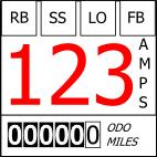

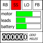
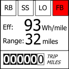
"Advanced" Info:Pack Volts, Cell Volts, Power, Combined display:
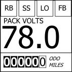

John H. Founder of Current Motor Company - opinions on this site belong to me; not to my employer
Remember: " 'lectric for local. diesel for distance" - JTH, Amp Bros || "No Gas.
Different Header:
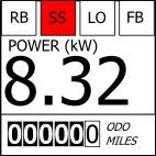
Realized that there was no "state of charge" on the last set. Even though there's an analog gauge some folks will want a more fine grained representation.
So, here's SoC in the header. The left most icon will display either FB (front brake), RB (rear brake) or SS (side stand) or some combination. The next icon is lit of LO is selected.
John H. Founder of Current Motor Company - opinions on this site belong to me; not to my employer
Remember: " 'lectric for local. diesel for distance" - JTH, Amp Bros || "No Gas.
Wow, that's outstanding. It's more than I would have thought could be put into a 1"x1" display and still be legible from a few feet away. I like having an indicator in the header of brake and side-stand switches, and having just one 'block' in the header for that I think will be fine (I'm hoping it will show RB, FB, BB or SS as appropriate). Not only will it give a quick indicator of which state of regenerative braking you're in, but also give a quick diagnosis for those 'why won't this @#$!% go!' times; this was common on the Z20's I believe, as the sidestand switch would fail and suddenly leave you stranded. I've no doubt this will happen less with the CMC scooters, but it's still possible that a rider might fail to get the sidestand all the way up and not realize it.
One comment: I'd still like to see avg/max speed, avg/max current draw and average Wh/mi in the 'advanced info' (I'm assuming the efficiency display is an instantaneous measure of energy over a short sample time, not over the duration of the ride).
Jon Stibal
2008 EVT America Z-20A
2011 CMC C130 - my daily driver:
I agree. Good job John!
How exactly does the cell volts indication intended to work? Will the user switch the cells in sequence - or is this just an average?
Also, regarding the temperature indication, while there is no room for numerals, some kind of ticks at specific warning temperatures should be added to the bars to aid in readability.
And while the electronic odo is fine. DO keep the analog speedometer, although an electronic version would be an improvement over the old-style mechanical speedometer arrangement.
I would put the percent state of charge in the advanced functions to provide a check on the analog "fuel gauge", not permanently on the header. Think of the typical ergonomically tried-but-true instrumentation on a car - analog gauges for the important functions, a switchable panel for trip odos, fuel economy, range and other stuff.
The one thing I haven't seen mentioned yet, but I really found nice to have in my LCD is a clock. Riding a motorcycle its kinda a pain to look at your watch to find out what time it is. Having a clock on the display is very handy. I installed a GPS chip just to pull down the time, a bit of overkill, but for my "one-off" gadgets, no big deal. Installing a serialized clock with a battery isn't to expensive. (Sparkfun.com has them :) GPS as a clock source is kinda cool though, takes about 1 second to pull time down from a satellite so my clock shows up almost immediately on my display and its always right (you do have to adjust for timezone/daylight savings).
I of course have much more room that 1x1 inch though... so clock may not fit 100% of the time, but as a selected option that could be nice.
I think having each portion of the display selectable would be handy. So header can rotate though "FB/RB/KS/..." and "Clock" and "small header items". Main display can rotate though Speed/SoC/Temps/Amps/Misc Graphs. Bottom rotates though Odo/Trip/Trip since Recharge. I have my trip meter reset once a recharge/balance has completed. That way I know how far I've gone since recharge without any manual resetting. So putting a trip meter that is manually resettable, but also tracking a "trip since recharge" would be nice as well.
Also when you display temps, it would be nice to show a green/yellow/red bar under so that we could see the zones that the bike will start limiting and shutdown...
The number isn't as important as how close I am to the limiting zone... 5 bars, one for each temp, and the 5th to show how close you are to each zone sort of thing might be nice.. or maybe make it an outline of each bar graph that has a solid part growing towards the yellow/red lines.. so you can see where you are in relation to "limiting on heat" ...
Hard to describe without a picture :)
Laters,
-d.
Jon, Paul & David:
Thanks for the feedback.
Paul & David:
Good idea! I'll add indicator ticks at the key points on the three temperature gauges.
David:
A clock may, or may not, get implemented this time around. Before we're done, you'll have a clock (I agree it's a great addition) - but maybe not this time around.
Paul:
If I do remove the SoC from the header and add it as an "advanced page" would you suggest going back to individual indicators or to something else?
For cell voltage, with the current version it's just an average value (as you know, but others might not, the BMS is primarily an analog implementation and doesn't communicate the individual voltages to the BCU). For a future version we'll certainly make individual cell voltages available.
Jon:
Yeah, I rode XM bikes for a while and that's why I want those indicators! Of course you're right ours will never actually malfunction, but in the rare chance they do ;-)
As far as average & max figures they're going to go into a set of pages called "History Information" display that may be populated a little more densely with the intent of reading that stuff while stationary. The intent of the efficiency / range page is to have a 10 mile rolling average. For an instantaneous tool just keep the Amps as low as possible.
Keep the feedback coming!
John H. Founder of Current Motor Company - opinions on this site belong to me; not to my employer
Remember: " 'lectric for local. diesel for distance" - JTH, Amp Bros || "No Gas.
I mentioned clock and temperature as my #5.
Those two are really essential to me.
Maybe not all the time, but certainly as an option.
I dont know about north america, but in Europe time is vital for some speed zones, parking etc. And temperature is always nice to have, especially if you are a all-year rider when icing could be a problem... :)
/K
Indeed you did - sorry for not responding directly before.
Clock we'll definitely add at some point. It's more of a system architecture question to decide where we locate the RTC (real time clock hardware) - when that's figured out we'll add the display.
Temperature - I can see this would be a nice addition. However, we don't have a temp sensor for ambient temperatures right now. Just for component temperatures (motor, batteries, power leads). We do read a "start of ride" temperature from one of the battery sensors - which if the bike has been cold soaked (left out at night!) will be close to ambient. We could display an "it's cold" message at start up - but my guess is that the rider will already know that (riders are generally much more keenly aware of the environmental conditions than car drivers). We probably won't add an ambient temp sensor just to add this to the display - however, I'll discuss with the guys and find out if ambient temp (rather than component temp) would be a useful additional input for our BCU. If it is then I'll definitely add this to the display.
At the end of the day we'll have to draw the line somewhere. For things like clock, calendar, temperature, altimeter, wind speed, dew point, barometric pressure, heart rate, blood pressure ( ;-) - hey, just teasing! ) the rider can always add their own "peripherals" because this is all info that doesn't depend on bike integration.
John H. Founder of Current Motor Company - opinions on this site belong to me; not to my employer
Remember: " 'lectric for local. diesel for distance" - JTH, Amp Bros || "No Gas.
JUST TEASING? I was hoping for these.
Awesome, thanks for the visuals John. They look great.
Definitely understood on the post-turnoff and getting a clock running. Though the clock would be nice, guess I'll just figure out a way to strap on the cell phone after all :)
Were you planning on visually discriminating then between regen FB / RB and actual bike braking? One of the things I loved on my Prius was the ability to discern when one was freewheeling versus using the electric motor versus generating excess power. For the hyper-miling fun, that was essential. I get a reasonable feel from the bike but some way to tell when the brake is being officially engaged versus regen would be great. Perhaps a green bar to the side of the RB / FB icon that goes up at 33, 66, and full increments to denote the level of regen?
There are three different brake icons: F (front), R (rear) & F+R (both). If those lights are lit it means regen is on. Also, on the current draw screen you will see the amps screen title will change from "AMP DRAW" to "REGEN :-)" and the number will turn from either blue or red to green. (well, maybe not a smiley face - but who knows?)
Software is coming along quite nicely. I should have a prototype on the bike by next week. Then we'll do (at least) one more hardware respin. Then we need to figure out how to roll it out to y'all.
John H. Founder of Current Motor Company - opinions on this site belong to me; not to my employer
Remember: " 'lectric for local. diesel for distance" - JTH, Amp Bros || "No Gas.
If it has a Ah counter like the Cycle Analyst I'll be happy to get rid of the cycle analyst all together. As long as I can program in my battery size say, 50Ah and the fuel gauge goes down from there. Plus when I plug in to charge, the fuel gauge slowly goes back up.
------------------------------
eRider 8000w Scooter - PDT Version
72v 50AH CHL battery
350A Sevcon controller
24km: Delivered - 24 September 2011
2490km: Installed dual 35w HID lights Bi-Xenon Projectors - 27 November 2011
8313km: Installed BMS -
Just to make it clear - this is not a separate "bolt on" product. It is an LCD that will be integrated into our line of bikes (the C130 and C124). It uses a digital output stream (serial data) from our proprietary Bike Control Unit (so even if we wanted to offer this as a separate product it's just not feasible without creating a "BCU-lite" which would be an expensive undertaking).
So, you won't be able to replace a cycle-analyst with this LCD. Well, not unless you buy one of our bikes to go with it... ;-)
John H. Founder of Current Motor Company - opinions on this site belong to me; not to my employer
Remember: " 'lectric for local. diesel for distance" - JTH, Amp Bros || "No Gas.
John,
To answer your question on Oct 26; yes, I'd just go back to the four RB/FB/SS/LO indicators. The analog "fuel gauge" under the V .30 software is working so consistently well (nice linear indication) that I don't see the point of a permanent SOC indication.
Paul
John, any chance of pulling error codes out of the Kelly controller and showing them too? I think you'd need to implement a CAN-bus interpreter in your BCU, but after that it would seem pretty simple. Showing the controller internal temp would also be good, in addition to the temps you monitor directly.
My electric vehicle: CuMoCo C130 scooter.
Mike,
Sorry, not this time around. However, a digital interface with the Kelly is in the design plans (we may go RS232 initially and then to CAN-bus later).
John H.
John H. Founder of Current Motor Company - opinions on this site belong to me; not to my employer
Remember: " 'lectric for local. diesel for distance" - JTH, Amp Bros || "No Gas.