The other day i was thinking about what could be a nice new Vectrix logo and a few ideas struck me so i thought about designing it and the result is as follows.
1. It had to have a lightning which would represent electricity and force

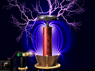
2. I wanted something which represented the "new" mechanincal electric technology, so i thought a sort of Tesla coil would be nice.
3. And then finally i wanted something which would represent speed, performance and Sport.


Here is the result:
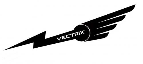
Finally i thought i would make the logo a reality,as today i am going to the 2nd Vectrix Barcelona Meeting and we are going to expose the Bikes in the Univerity of Barcelona for people to see.
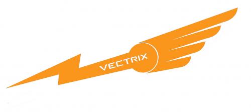
I thought of giving the Logo a orangy-Yellow colour, although i dont know if the final colour makes a good contrast with my silver Vectrix, and as the decals are made in transparent adhesive, also the background has the final effect abit dull and brownish look. But anyway thats it for today, i will perfection the colour and also a small error in the oposing decal of the foto which has the Vectrix name flipped around incorrectly.I think maybe the size was also a few centimeters too big, maybe not if i would have taken out the "electric" decal??
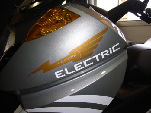
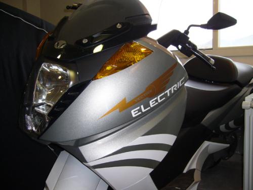
All opinions are welcome, and if there are any constructive ones, better so that it can be inproved.
RaDy


RaDy
I like it. We played around with lightning bolts but couldn't come up with anything that looked good. You've managed to come up with a good looking design that incorporates the bolt well.
You could maybe shorten it and fatten it. Shorter by tighter angles on the bolt and fatter by a wider bolt. That way you could make the Vectrix bigger.
John H. Founder of Current Motor Company - opinions on this site belong to me; not to my employer
Remember: " 'lectric for local. diesel for distance" - JTH, Amp Bros || "No Gas.
Nice job! "Green" would be a nice color!! ;-)
I very much like the starburst in the "C" logo that you came up with. Has a "Galactical" flavor, which is just downright kewl!!!
I often refer to my vectix as "The Pod" from the retro-futuristic pod race scene of Star Wars.
Love it!! Would look good in gold! A great design!
marcopolo
Not bad, but there is still some room for improvement... ;-)
This information may be used entirely at your own risk.
There is always a way if there is no other way!
Hey Mik - how about putting CuMoCo on there instead? ;-)
RaDy - another idea... shorten the bolt, increase the angle of the whole thing and put Vectrix beneath it. Like the Honda wings. If you resize your logo to the same dimensions as the Honda and Aston Martin logos then I suspect it becomes unreadable.
However, having said that - as you have it fits very well on the bike. It depends if you want to use the logo on other stuff as well. Perhaps two related versions?
(moccasin - thanks for the vote of confidence for our logo - it's cool to be kewl!)
John H. Founder of Current Motor Company - opinions on this site belong to me; not to my employer
Remember: " 'lectric for local. diesel for distance" - JTH, Amp Bros || "No Gas.
Mooolt be Raj, ha creat furor!!
Tinc ganes de veure-ho en directe... ens veiem a la ETSEIB.
Salutacions,
R
Thanks to all for the suggestions.
Marcopolo, you just took it off my mind (is this because of your info tools) i was just thinking that the best contrast with my Vectrix would be Gold, Silver or White.
I was also thinking of bright yellow or bright light blue or bright light purple , like bolts from storms but i think Silver or Gold would have a good contrast, although maybe too flashy, so white would be the "decent" option.
I think i will try the three of them and also play around abit with the shapes like JDH suggests , although i think that if i take out the "electric" decal , the actual shape and size would fit in quite well.
Lets see, when i have abit more time i will look into it and post results.
RaDy
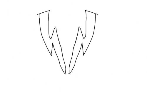
I don't know why we would bother inventing a new logo for Vectrix, but when I saw this, I couldn't help imagining one myself. It happened immediately due to it's obviousness: (really quick scetch with my index finger on my touchscreen:-))
"doing nothin = doing nothing wrong" is invalid when the subject is environment
I thought of something like that but it was looking more like a "W" , that would have been more for Wectrix :)
Actually , i wasnt trying to do the company Logo, more like a "Special" Decal for the sides of the Vectrix, to emphasise the Power of electricity.
Also, i am sorry for the Vx-1e or Vx-2, but they wouldnt deserve to "wear" them :)
Im just getting the mark 2 version printed with correct colours and properly made out of "Decal" materials , which will withstand water, heat and sunlight for a few years.
I'm really interested in making a white decal saying "electric", like the one that 2009 VX1 wear...
The 2007-08 electric decal is too small and nobody can read it....
Ok , so here is the "Winged lightning" or "Winged Bolt" in its final colour and Decal material. Maybe its perfect place would have been in place of the "Electric" decal and this one put in the lower half but i didnt want to remove it so the final look might look abit messy. Im leaving it like that for the moment!

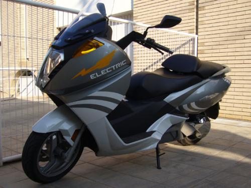

And here are some sketches and ideas for a proper Vectrix Logo (not a side Decal but a company Logo), again playing with the Bolt,Tesla Coil and the wings. Here the idea was to emphasize that the wings come out of the tesla coil as sparks, therefore these can be shorter and more electrically sharp, also i tried to fit the Vectrix original "V" somewhere. For the moment i am still playing around and thinking so i wont do a final sample untill it doesnt look perfect.
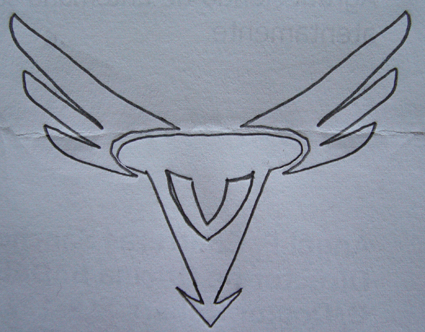

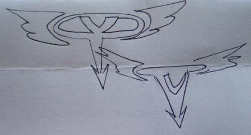
All ideas and opinions are very welcome.
Rajesh
I agree, green electric would be great. Can you upload the design of the two parts, left and right of this Logo?